

Saturday, 3 December 2011
New 'TIGER reviewed' map layer for ITO Map
In response to a comment left on this blog some time back we have created a new 'tiger reviewed' map to show which roads in the USA have been checked since import using TIGER and which have not. It seems that most roads still have their 'tiger:reviewed=no' tagging, even those that have been edited in the past few years. Green is used for roads that have had their tiger=reviewed tag removed; blue is used for roads that have been edited in the past three years but which still have their tag; roads in red and orange still have their 'tiger:reviewed=no' tag and have also not been edited in the past three years. Lighter and thinner lines are used for minor roads.

Tuesday, 22 November 2011
US road fatality mapping available online
Do check out our new road fatality mapping for the USA giving details of the 369,629 fatalities on US roads between 2001 and 2009. Use the 'share' features to tweet a link to the current map view, send a URL by email, embed a link to the map view in a website or even embed a slippy map in your own website of blog.*
Here is an embedded slippy map for the USA (try panning and zooming and selecting place using the search):
Here is an embedded map for downtown Los Angeles:
*You can easily embed a map for an area of interest in your own website or in Blogger. To do this first select the map view of interest, then click on the share icon and copy the text in the box below the 'embeded' heading and paste it into your website. Adjust the height and width as appropriate. It isn't yet possible to embed maps in Wordpress.com blog.
Sunday, 20 November 2011
Road casualty (RTA) mapping for the USA coming later this week
We are getting ready to launch an online map showing fatalities from Road Traffic Accidents in the USA over a 10 year period next week in advance of Thanksgiving. In the mean time here are a few screen grabs.
The first image is for Manhattan Island (New York) and shows that most fatalities are of pedestrian (dark blue background with lighter figure). The number of Cyclists (dark green background with lighter figure), motorcyclists (orange with darker figure) and vehicle occupants (purple with a darker figure) is also significant. Pedestrians are generally in their 30s-50s, motocyclists are more likely to be in the 20s and 30s. The youngest pedestrian death that I can see is of a 3 years old boy and the oldest is of a 99 man - click to view image at full size.

And here is the pattern in Washington DC where the percentage of vehicle occupants is higher; the spread of ages seems pretty wide was well.

This map shows the Silicon Valley are with a cluster of pedestrian fatalities around Stanford University and a string of vehicle fatalities on highway 101.

The overview for Washington State (Seattle is on the right) invites the user to zoom in, but even at this scale it is possibly to see how the crashes are distributed across the territory and the distribution by mode.

By contrast, this overview map showing the area around near Rapid City, South Dakota shows that nearly all the of fatalities are of motorcylists in an area that is very popular touring area motorcyclists btw:

In you want to have an idea what the service will look like when it comes then do try our UK Road Casualty mapping service.
We are keen to add details for every country that has suitable data available. If you can recommend any good sources of such data then please add a reference in a comment at the end of this blog or email us.
Thursday, 17 November 2011
Road casualty mapping for GB roads
Can you give this new road casualty mapping service a go for us? It shows road casualties for Great Britain for the period 2000 - 2010. Zoom in for more details and find a detailed explanation at the bottom of the page. We are releasing it in the run up to the World Day of Remembrance for Road Traffic Victims which takes place this Sunday in many places around the UK and in many other countries.
We are likely to be getting some good coverage of it tomorrow and over the weekend and are keen to get lots of people trying it between now and then. If you have any problems or suggestions then email us at support@itoworld.com. Alternatively you might prefer use twitter (@itoworld). One can embed this mapping into websites and also into Blogger. Instructions are available on the main page itself. Try it here:
It has been developed with financial support from the Department for Transport and from the Technology Strategy Board as part of their funding of Ideas in Transit, a five year project to "promote the understanding, awareness and development of user innovations relevant to transport".
We have a version for the USA in preparation which will be ready prior to Thanksgiving Day (24th November). More soon.
Wednesday, 1 June 2011
ITO World at Next11 Conference
This year's Next Conference was all about 'Data Love' and we were delighted to be presenting in the "Bright Data, Big City: How Data Transforms Metropolitan Life" stream.
"Visualising Big Data" was the theme for the presentation and you can see it below, click on the HD button to select a higher quality version.
"Visualising Big Data" was the theme for the presentation and you can see it below, click on the HD button to select a higher quality version.
Thursday, 7 April 2011
New railway overlays available on ITO Map
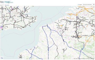
ITO World Ltd is pleased to announce the availability of four new railway overlays on ITO Map making further details contained within OpenStreetMap visible for the first time. These layers are available globally and the data for them is updated daily. The layers all have 'keys' which can be clicked to link to a page on OpenStreetMap wiki with more details about the layer and ITO Map.
The electrification overlay highlights electrified mainline railway lines in yellow, red and orange (for third-rail, contact line and unspecified electrification respectively). Blue is used for non-electrified lines. Lines where electrification is not known are shown in grey. This example show the third-rail electrified lines south of London in yellow and the contact-line electrification north of the city (click on any image to open the browser with the same view).

The railway engineering overlay highlights viaducts, bridges, embankments, cuttings and tunnels on mainline rail services (yellow, red, orange, light blue and dark blue respectively). This view of London shows all of these features.

The railway stations overlay highlights platforms. Platforms with platform numbers are in blue, those without are in red. The image below shows that Kings Cross Station and St Pancras Stations have numbered platforms and that Euston has platforms but these don't have references.

Finally, the loading gauge overlay indicates the loading gauge to which the line has been constructed which determines the size of trains that can be accommodated. In particular it indicates if shipping containers can be carried. There is virtually no data in OpenStreetMap of this type outside the East of England.

ITO will be releasing further layers in different 'themes' in due course (such as sports and landuse) and will be refining and enhancing the existing overlays. We are always happy to receive suggestions and bug reports.
ITO Map has been developed with support from 'Ideas in Transit, a five-year UK government funded research program.
The electrification overlay highlights electrified mainline railway lines in yellow, red and orange (for third-rail, contact line and unspecified electrification respectively). Blue is used for non-electrified lines. Lines where electrification is not known are shown in grey. This example show the third-rail electrified lines south of London in yellow and the contact-line electrification north of the city (click on any image to open the browser with the same view).
The railway engineering overlay highlights viaducts, bridges, embankments, cuttings and tunnels on mainline rail services (yellow, red, orange, light blue and dark blue respectively). This view of London shows all of these features.
The railway stations overlay highlights platforms. Platforms with platform numbers are in blue, those without are in red. The image below shows that Kings Cross Station and St Pancras Stations have numbered platforms and that Euston has platforms but these don't have references.
Finally, the loading gauge overlay indicates the loading gauge to which the line has been constructed which determines the size of trains that can be accommodated. In particular it indicates if shipping containers can be carried. There is virtually no data in OpenStreetMap of this type outside the East of England.
ITO will be releasing further layers in different 'themes' in due course (such as sports and landuse) and will be refining and enhancing the existing overlays. We are always happy to receive suggestions and bug reports.
ITO Map has been developed with support from 'Ideas in Transit, a five-year UK government funded research program.
Wednesday, 30 March 2011
ITO Map is now available globally
OK, so we have installed our new servers and they are performing well so we have removed all the geographic restrictions from our new ITO Map service. This means that you can now check out waterways in Australia, schools in Berlin, electricity generation and supply in Japan or anything else that takes your fancy! We have also relaxed the zoom level restriction allowing you to zoom out to level 8 for all map overlays.
We released the services for the UK and parts of northern Europe on the 18th March and then extended to the USA and parts of Canada and the Caribbean on the 23rd March.
ITO Map has been developed with support from Ideas in Transit, a five-year UK research project following user-led information technology innovation in the transport domain with support from the UK Department for Transport and the Technology Strategy Board.
Wednesday, 23 March 2011
ITO Map extended to cover USA, Canada and the Caribbean
We have just extended coverage of our ITO Map overlay map service to most of the USA and Canada and all the Caribbean islands (ie all of the USA except Hawaii and Alaska and all of Canada except the northern wilderness). Read more on the ITO Map wiki page and in the earlier announcement accompanying the release for the UK and parts of Europe.
Users of the existing European service may notice that we have reduced the maximum zoom level for 8 to 10 for some scripts and increased it from 11 to 10 for some others. Further expansion of the service will come by the end of next week.
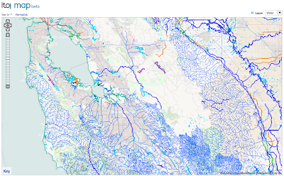
This first screenshot highlights lakes, rivers and ferry routes in British Columbia (lakes in light blue, rivers in dark blue, coastline in green, canals using tan and ferries in read). Click on any of these screenshots to open the browser for the given views. Keys are provided for all overlays in the bottom left corner of the map. Clicking on the key takes one to further details on the OSM wiki.

This next view is of railways in New York (Mainline services are in black, underground rail in red and light rail in blue).

This next one is for speed limits in Seattle (lowest speeds are green, higher speeds in purple and blue). Full details in the key.

And finally electricity distribution around Baltimore with sub stations in red, power distribution in various colours according to voltage and black where no voltage is specified.

Users of the existing European service may notice that we have reduced the maximum zoom level for 8 to 10 for some scripts and increased it from 11 to 10 for some others. Further expansion of the service will come by the end of next week.
This first screenshot highlights lakes, rivers and ferry routes in British Columbia (lakes in light blue, rivers in dark blue, coastline in green, canals using tan and ferries in read). Click on any of these screenshots to open the browser for the given views. Keys are provided for all overlays in the bottom left corner of the map. Clicking on the key takes one to further details on the OSM wiki.
This next view is of railways in New York (Mainline services are in black, underground rail in red and light rail in blue).
This next one is for speed limits in Seattle (lowest speeds are green, higher speeds in purple and blue). Full details in the key.
And finally electricity distribution around Baltimore with sub stations in red, power distribution in various colours according to voltage and black where no voltage is specified.
Friday, 18 March 2011
ITO Map - A new map overlay service for OpenStreetMap
ITO are pleased to announce ITO Map, a set of new overlay maps for OpenStreetMap that highlight data layers within OSM which are invisible using the standard map views; these include speed limits, highway lane widths, whether rivers are navigable and electricity distribution. The overlays available using this service are described in more detail on the ITO Map wiki page.
For the first few days we are providing the service for two areas, the first includes the UK, northern France, Holland, eastern Germany up to southern Norway; a separate area coveering the bay area around San Francisco is also included. We will roll out the service to more areas over the coming days with the intention of going global within a few weeks. All overlays have keys available at the bottom left and in addition these keys link to the wiki page for further details when clicked (or 'right clicked').
Here are examples from some of the 22 map views that are currently available. This first one shows water features around Bay Area in California. The colours are chosen to make a clear distinction between different feature types (rivers and streams are blue, canals are tan, lakes turquoise, reservoirs purple and the coast in green).
And this one shows the number of lanes for highways around Utrecht in Holland (dual 2 lane carriageways are shown in green, 3 lanes in blue, four lanes in purple and 6 lanes in yellow).
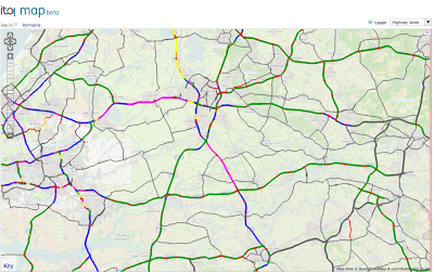
And road speed limits for major roads in the United Kingdom (70mph in dark blue, 60mph in light blue, 50mph in violet, 40mph in red and 30mph in orange).
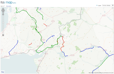
Former railways in north Wales (green for heritage lines, red for disused lines where the tracks still in place, blue for dismantled where the alignment is still in tact but the tracks have been lifted and violet for where there is no remaining evidence of the route).
Electricity distribution in northern France and surrounding countries (dark blue for 400KV, purple for 320KV, orange for other high tension voltage and thin green lines for low voltage minor lines). Power generation plant and substations/transformers are also shown.
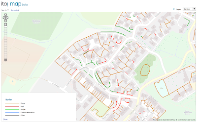
And finally some amazing 'micro-mapping' for Cambourne, Cambridgeshire detailing all the fences, hedges and walls in town (green for hedges, brown for fences and red for walls). I think this is a great example of how OpenStreetMap is going way beyond the place where commercial mapping stops.
The tiles will initially be based on daily diff planet data (which will normally be updated daily with a 24 hour processing lag). The service is likely to be slower after about 04:00 hours UTC when the new data is loaded. We are in the process of adding server capacity to improve performance further and allow a global release but wanted to get the service available for at least part of the world immediately. In the short term if the service is too slow then please give it a break for a hour or so and before trying again. The overlays can only display linear and area features at this stage, we will add the ability to handle nodes in due course. In time we will include overlays from other data sources as well as OpenStreetMap, hence the name 'ITO Map' rather than somthing which included OpenStreetMp or OSM in the title.
Do add comments and suggestions to the wiki page. We will gather feedback over the next week and iron out any wrinkles.
For the first few days we are providing the service for two areas, the first includes the UK, northern France, Holland, eastern Germany up to southern Norway; a separate area coveering the bay area around San Francisco is also included. We will roll out the service to more areas over the coming days with the intention of going global within a few weeks. All overlays have keys available at the bottom left and in addition these keys link to the wiki page for further details when clicked (or 'right clicked').
Here are examples from some of the 22 map views that are currently available. This first one shows water features around Bay Area in California. The colours are chosen to make a clear distinction between different feature types (rivers and streams are blue, canals are tan, lakes turquoise, reservoirs purple and the coast in green).
And this one shows the number of lanes for highways around Utrecht in Holland (dual 2 lane carriageways are shown in green, 3 lanes in blue, four lanes in purple and 6 lanes in yellow).
And road speed limits for major roads in the United Kingdom (70mph in dark blue, 60mph in light blue, 50mph in violet, 40mph in red and 30mph in orange).
Former railways in north Wales (green for heritage lines, red for disused lines where the tracks still in place, blue for dismantled where the alignment is still in tact but the tracks have been lifted and violet for where there is no remaining evidence of the route).
Electricity distribution in northern France and surrounding countries (dark blue for 400KV, purple for 320KV, orange for other high tension voltage and thin green lines for low voltage minor lines). Power generation plant and substations/transformers are also shown.
And finally some amazing 'micro-mapping' for Cambourne, Cambridgeshire detailing all the fences, hedges and walls in town (green for hedges, brown for fences and red for walls). I think this is a great example of how OpenStreetMap is going way beyond the place where commercial mapping stops.
The tiles will initially be based on daily diff planet data (which will normally be updated daily with a 24 hour processing lag). The service is likely to be slower after about 04:00 hours UTC when the new data is loaded. We are in the process of adding server capacity to improve performance further and allow a global release but wanted to get the service available for at least part of the world immediately. In the short term if the service is too slow then please give it a break for a hour or so and before trying again. The overlays can only display linear and area features at this stage, we will add the ability to handle nodes in due course. In time we will include overlays from other data sources as well as OpenStreetMap, hence the name 'ITO Map' rather than somthing which included OpenStreetMp or OSM in the title.
Do add comments and suggestions to the wiki page. We will gather feedback over the next week and iron out any wrinkles.
Wednesday, 26 January 2011
Some graphs relating to OpenStreetMap GB road name completeness
Here are some graphs derived from our service that compares road names in OpenStreetMap with those in the Ordnance Survey's OS Locator product.
This first graph shows how many road names are missing from OpenStreetMap that are in OS Locator with the 408 districts/boroughs organised with the ones with the least missing on the left and the most missing on the right. Do be aware that the size of authorities varies very considerably from the Isles of Scilly with 57 roads to Leeds with 12,000! Clearly there are a small number of larger places with where a lot of work is required.

This next graph shows the percentage completeness of these same authorities. The colour bars match with the thematic map. Nearly half the authorities now have 75% completeness and do be aware that many of the missing road names are likely to be for very minor rural roads/tracks or for small cul-de-sacs in town. As such an authorities with 75% completeness is likely to be very usable for most purposes.

This final graph shows all the 253,000 road names in OS Locator that are currently missing from OpenStreetMap as a cumulative version of the first graph. The most complete authorities are again on the left. It shows that one could complete the 'best' 204 authorities by adding 50,000 roads but to complete the others would need a further 200,000 roads with is a lot of work to do manually.

Personally, I am starting to think about a bot that could add a lot of these roads automatically for the less well covered areas using OS VectorMap District an OS Locator. The bot would do what it was sure about for an area as instructed by a mapper who would then do a cleanup job of the area afterwards.
Thursday, 20 January 2011
OpenStreetMap GB - a progress report!
Back in May 2010 ITO World Ltd announced a new online service that compared road names in OpenStreetMap with names released as Open Data by the Ordnance Survey in their OS Locator product in April 2010. We then launched an analysis service which provided statistics for each district/borough in July 2010.
We are now pleased to be able to announce an upgrade to this service which includes a useful thematic map view showing the level of completeness (at the road level) for every district/borough in Great Britain (compared to OS Locator). Here is the overview. Red equals 0-50%, orange 50-75%, yellow 75-95% and blue 95-100%. It is a slippery map and one can zoom into any part of the country.

The district summary report indicates that there are currenrtly 34 districts have greater than 95% road completeness and 171 have over 75% of the roads included (out of a total of 408 districts/boroughs).
As well as thematic view there is still the 'roads missing' view which has been enhanced with administrative boundaries (the thin red lines). The prominence of 'minor errors' as been reduced by always showing them in grey (minor errors are where the only disagreement is in the use of apostrophes - ie Kings Street and King's Street etc).

This information is also available in the main Potlatch editor (use the new Potlatch 2 version to immediate access to the layer).

We have also introduced a page for each district detailing the road missing from OpenStreetMap and also any possible errors in the OS Locator. This page is useful both for mappers wishing to improve the data in their areas and also to authorities wishing to assess the usefulness of OpenStreetMap within their territory. This image shows the page for Cambridge.

This report indicates that in Cambridge there are a total of 66 roads in OS Locator that are missing from OSM and also a total of 7 possible major errors and 4 minor errors in OS Locator itself. We do not currently identify roads that are in OpenStreetMap but which are missing from OS Locator which might also be useful to the OS. Personally I think this looks like 'Big Society' in action!
Here are the possible major errors in OS Locator:
Basset Close should be "Bassett Close"
Chesnut Grove should be "Chestnut Grove"
Kathleen Elliot Way should be "Kathleen Elliott Way"
J J Thompson Avenue should be "J J Thomson Avenue"
Malletts Road should be "Mallets Road"
Northfields Avenue should be "Northfield Avenue"
Winderemere Close should be "Windermere Close"
And the minor errors:
Coldham's Lane should be "Coldhams Lane"
Coldham's Grove should be "Coldhams Grove"
Friar's Close should be "Friars Close"
Parson's Court should be "Parsons Court"
Overall OpenStreetMap now includes 588,000 names roads that match with names in OS Locator (out of a total of 838,000) and of these 140,000 have been added since 1 April 2010 when OS Locator was released. Of course OpenStreetMap is much more than just a road map and has a huge amount of additional detail that is not available from the OS.
For the avoidance of doubt the Ordnance Survey will validate any claims independently for their own reassurance and also to avoid any licensing issues with the OSM CCBYSA and ODBL licenses used by OSM.
For the purposes of this analysis we are using the OS Boundary Line data for districts/boroughs directly to ensure that we have 100% accurate coverage (boundaries are not fully represented in OSM directly yet).
This product has been developed with financial support from the Department of Transport and from the Technology Strategy Board as part of their funding of Ideas in Transit, a five year project to "promote the understanding, awareness and development of user innovations relevant to transport". ITO World Ltd, the Ordnance Survey, the University and the West of England and the University of Loughborough make up the project team.
We are now pleased to be able to announce an upgrade to this service which includes a useful thematic map view showing the level of completeness (at the road level) for every district/borough in Great Britain (compared to OS Locator). Here is the overview. Red equals 0-50%, orange 50-75%, yellow 75-95% and blue 95-100%. It is a slippery map and one can zoom into any part of the country.
The district summary report indicates that there are currenrtly 34 districts have greater than 95% road completeness and 171 have over 75% of the roads included (out of a total of 408 districts/boroughs).
As well as thematic view there is still the 'roads missing' view which has been enhanced with administrative boundaries (the thin red lines). The prominence of 'minor errors' as been reduced by always showing them in grey (minor errors are where the only disagreement is in the use of apostrophes - ie Kings Street and King's Street etc).
This information is also available in the main Potlatch editor (use the new Potlatch 2 version to immediate access to the layer).

We have also introduced a page for each district detailing the road missing from OpenStreetMap and also any possible errors in the OS Locator. This page is useful both for mappers wishing to improve the data in their areas and also to authorities wishing to assess the usefulness of OpenStreetMap within their territory. This image shows the page for Cambridge.
This report indicates that in Cambridge there are a total of 66 roads in OS Locator that are missing from OSM and also a total of 7 possible major errors and 4 minor errors in OS Locator itself. We do not currently identify roads that are in OpenStreetMap but which are missing from OS Locator which might also be useful to the OS. Personally I think this looks like 'Big Society' in action!
Here are the possible major errors in OS Locator:
Basset Close should be "Bassett Close"
Chesnut Grove should be "Chestnut Grove"
Kathleen Elliot Way should be "Kathleen Elliott Way"
J J Thompson Avenue should be "J J Thomson Avenue"
Malletts Road should be "Mallets Road"
Northfields Avenue should be "Northfield Avenue"
Winderemere Close should be "Windermere Close"
And the minor errors:
Coldham's Lane should be "Coldhams Lane"
Coldham's Grove should be "Coldhams Grove"
Friar's Close should be "Friars Close"
Parson's Court should be "Parsons Court"
Overall OpenStreetMap now includes 588,000 names roads that match with names in OS Locator (out of a total of 838,000) and of these 140,000 have been added since 1 April 2010 when OS Locator was released. Of course OpenStreetMap is much more than just a road map and has a huge amount of additional detail that is not available from the OS.
For the avoidance of doubt the Ordnance Survey will validate any claims independently for their own reassurance and also to avoid any licensing issues with the OSM CCBYSA and ODBL licenses used by OSM.
For the purposes of this analysis we are using the OS Boundary Line data for districts/boroughs directly to ensure that we have 100% accurate coverage (boundaries are not fully represented in OSM directly yet).
This product has been developed with financial support from the Department of Transport and from the Technology Strategy Board as part of their funding of Ideas in Transit, a five year project to "promote the understanding, awareness and development of user innovations relevant to transport". ITO World Ltd, the Ordnance Survey, the University and the West of England and the University of Loughborough make up the project team.
Subscribe to:
Posts (Atom)

