A busy few months, fresh from *two* spreads in Wired magazine, we made a cameo appearance in the BBC's 'Joy of Stats' documentary, presented by none other than Hans Rosling.
After countless email enquiries and full of Christmas spirit, we decided to make Hal's glorious visuals easily available to the public, with our very own art gallery.
The gallery lives at www.whitewall.com/itoworld and from there you can choose an image, customise it to the size and format you want, and order a print. The quality is excellent and you can even order canvases, wooden frames, lightboxes... (there is a "Configure Product" button on the bottom left when you click through).
We have the classic 'OSM: Year of Edits'
The beautiful London Bus Network
The ethereal Marine Traffic
And individual Year of Edits cities, like Milan
I have a couple of 1 metre prints on my walls and they look fabulous!
There have been a few minor updates to the NaPTAN system. First we have re-ordered the warnings to make the manual warnings more prominent. This will help users discover and rectify manual warnings in their area. We have also made the ATCO Code and Nat Gaz ID more prominent on the feature pages to help when comparing NaPTAN with other systems.
ITO have released a new OSM Analysis service that gives an overview of OpenStreetMap completeness for Great Britain when compared to the Ordnance Survey's OS Locator product.
The results can be viewed both on a map and as a summary report; the map highlights discrepancies between the sources and the summary gives headline figures for each of the 400+ district/boroughs in Great Britain. The summary reports use OS Boundary-Line.
The service will be useful both to volunteer mappers who wish to improve the OpenStreetMap in their area and also to end-users who wish to know how good the data is for a particular area.
Here is the map view:
And here is part of the summary report which can be sorted in various ways.
If errors are found in the Ordnance Survey's data by a mapper, which do sometimes occur, then the special 'not:name' field in OpenStreetMap can be used to report this and the discrepancy will no longer appear in the above reports and mapping.
Information in the 'not:name' field can also be used by the Ordnance Survey to help them improve their data quality by giving them an addition source of possible errors to check.
This service has been developed by ITO with support from Ideas in Transit which is a 5 year research project funded by the UK Government in which both ITO and the Ordnance Survey are partners.
ITO have produced a mapping layer which can be used within OpenStreetMap editors to check for differences between OpenStreetMap data and Ordnance Survey Locator (which has been released as Open Data).
Within the OpenStreetMap editor the new layer appears as a series of boxes with associated names for all streets that are in OS Locator but which are not in OSM within the same bounding box with a small buffer area added.
Normally a box in this layer indicates an error or omission in OSM, however there are also some errors in the OS data. The not:name can be added to the OSM data in these situations and the box will not appear in subsequent analyses and there is less risk that someone transcribing incorrect OS data into OSM at a later date.
An example of an error in OS Locator is the mispelling of Arthur's Terrace in Ipswich has been entered as 'Athurs Terrace'. I have added a tag 'not:name=Athurs Terrace' to the street and it now on longer shows on the analysis.
How many errors are there in OS Locator? I have been through data for Ipswich and have found 7 errors where OS Locator data does not match the relevant street sign. I have added not:name tags to all of these, follow the links to see how they work. It is also useful to add a 'note' field with a description of why the not:name tag has been added.
In addition to the above I am investigating a number of other potential errors at present which will probably add another 5 or so errors to the list creating a total of 12 out of some 3000 named road names in the town meaning that OS Locator is 99.7% accurate which isn't bad. This test does not of course show the streets which are in OSM but missing from OS but that is a separate test for another day and OSM should perform pretty well on that one.
To access the above mapping from Potlatch add the following string of text into the 'custom' layer box.
http://tiles.itoworld.com/os_locator/!/!/!.png
As a technique I would recommend doing a first pass getting rid of the bigger and the less complicated boxes and then do a second pass on the remaining smaller ones as it can be difficult to make sense of multiple overlapping boxes in one pass.
The analysis is current run each night based on the Geofabrik GB data published earlier the same day so changes to OSM will show up in the map rendering not the next day but the day after that. You may therefor choose to do a pass across an area one day and then do a second pass a couple of days later.
Also, do note that the OS bounding boxes seem to have a small rounding error resulting in edges of the bounding box that do not always exactly match the end of the relevant street.
Only a week after ITO World Ltd published an animation showing flight movements over Europe in the period after the 2010 eruptions of Eyjafjallajökull the online plays have hit 500,000. We have had mentions in the online versions of the Economist, the Guardian and the Huffington Post and it was shown on Canada's Discovery television channel.
The animation is based on information collected by volunteers of the FlightRadar24 project who use VHF receivers to gather data from transmission from commercial planes. The base mapping is from OpenStreetMap.
On 17 April 2010 there were virtually no flights: By 18 April 2010 there were a few more: By 19 April 2010 there were more flights over mainland Europe but still none from United Kingdom airports:
From 20 April 2010 flights were pretty much back to normal (note that there is still no data for much of France and for some other parts of Europe). As well as our original animation which we released using a creative commons share -alike license there is now a version set to music and one with an ash cloud overlay.
ITO World are experts at transport data presentation and Open Data. We have produced an animation for Sir Tim Berners Lee which he showed at TED of edits to OpenStreetMap during 2009 and our 'OSM 2008: A Year of Edits' animation has been viewed 145,000 times online and shown at numerous conferences.
ITO has released a new version of the NaPTAN Management service which provides a number of new features.
Metric Downloads There is a now a new Metrics Download Page where users can download in CSV format a number of different Metrics. It is possible to download counts of live, suppressed or resolved warnings for any scope for any date to get a snapshot of where the system was at any point. The system can also provide trend information to monitor warning types over a given period and establish how the system is performing over time.
New Tests and Test Adjustments A new test has been added called "Stop Indicator Not Preferred". This tests whether the Stop Indicator is one of the new preferred list of indicators that should be used. Other tests have also been tightened to help keep the NaPTAN dataset continually improving.
A number of other minor features and bug fixes have been added to help improve the service.
As Making Public Data Public gathers momentum in government, the focus is now moving to the need for open transport data in the UK. I was interviewed by the BBC about the Ordnance Survey open data release and took the opportunity to talk about "the missing link", that is transport schedule data.
Its taken a little while for us to publish this, but I'm sure you will agree it was worth the wait. Here is Tim Berners-Lee showing off some of our visualisation magic at this year's TED conference in "The Year Open Data Went Worldwide":
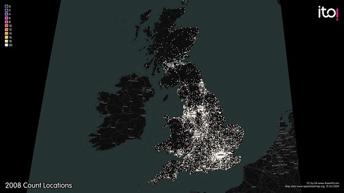
As some of you have noticed, OSM Mapper isn't updating right now. Why you may ask? Well the OSM planet file was broken for a week, which is essential so we couldn't do much about that, and take a look at this:
Thanks to the growth of the OSM community, the data is growing exponentially. We are amazed and delighted by this growth, but it does give us some development challenges with our global OSM model. We've taken the down-time as an opportunity to take a look at how we process OSM data.
Fear not, Hal is working on our new and improved global OSM model. We'll let you know when the new model is in operation and OSM Mapper is updating again.
We are proud to announce that our work has been displayed at this year's TED conference, where the world's greatest thinkers and doers come together. We were asked to provide visualisations that helped tell the story of open data in 2009, for Sir Tim Berners-Lee to give an update on open data since his talk last year.
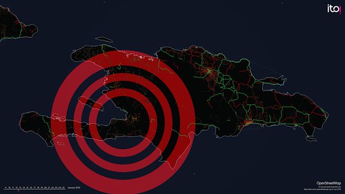
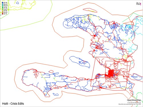
We chose to tell the story of 'OpenStreetMap - Project Haiti'.
We all followed the crisis that unfolded following the Haiti earthquake, many of us chose to donate money, a few were flown out and deployed as part of the relief effort. But what practical impact can many have without being there in Haiti itself? Well, during this crisis a remarkable story unfolded; of how people around the world could virtually collaborate and contribute to the on-the-ground operations.
With the little existing physical, political and social infrastructure now destroyed or damaged, the situation was especially challenging for aid agencies arriving on the ground. Where are the areas most in need of assistance, how do we get there, where are people trapped under buildings, which roads are blocked? This information is important to the rescue agencies immediately after the event, and to the longer rebuilding process. In many developing countries, there is a lack of good mapping data and particularly after a crisis, when up-to-date information is critical to managing events as they evolve.
Enter OpenStreetMap, the wiki map of the world, CrisisMappers and an impromptu community of volunteers who collaborated to produce the most authoritative map of Haiti in existence. Within hours of the event people were adding detail to the map, but on January 14th high resolution sattelite imagery of Haiti was made freely available and the Crisis Mapping community were able to trace roads, damaged buildings, and enter camps of displaced people into OpenStreetMap. This is the story of OpenStreetMap - Project Haiti:
Each flash represents a new edit into OpenStreetMap, and this visualisation is a vivid picture of how much work was contributed by volunteers, following the quake. First the primary and secondary roads (green and red) are added and then smaller residential streets and many other features such as the blue glowing camps of displaced people that emerge.
Its not all about OpenStreetMap however, a variety of organisations provided technical solutions with vital services, such as Ushahidi - a service where anyone in Haiti can send an SMS message with their location and report an emergency or need. All this information is then aggregated and publicly displayed in near real-time, on a platform that almost anyone can use.
With all the talk of open data and the launch of Data.gov.uk, its very easy for us to get excited about the release of huge tranches of government data, but means little to anyone else. We now have the potential for many new services that will bring tangible benefits, in this case for the crisis management of the Haiti Earthquake. After the crisis, thousands of people from all over the world were able to contribute and build what is now the most complete map of Haiti - in use on the ground by the United Nations, Ushahidi, and the default map of choice for NGOs. This picture says it all:
OpenStreetMap being used on a GPS unit for search and rescue in Haiti by Fairfax County Urban Search & Rescue Team
What does all this have to do with ITO World and transport? Well, we want to visualise and tell the story of transport - how does the network function, what is the story of your commute, how will this planning decision affect transport in my city? We are working on powerful analytical tools that will visualise the current status, and future scenarios of transport networks enabling us to make better decisions. By creating a narrative around transport, people can understand how and why decisions are being made, and collaborate to build a better transport system that meets their needs.
Exciting times! Data.gov.uk launches today and we are presenting at the launch event. Read more about it at the BBC and Guardian. We will be posting slides and other media from the event later today, and Tweeting from the @itoworld Twitter account.
This is some of what we'll be showing off:
And our work has just been featured on the excellent Flowing Data blog.
During the response, it was clear that better coordination tools were needed. With regards to OpenStreetMap editing, a tool to show where edits were occurring and where further efforts should be focused was necessary.
Our own OSM Mapper, currently runs on a 48hour update cycle and was of little use for coordinating live, crowdsourced map edits. We hope to be running on a much shorter update cycle in the future, which should be of more use for coordination during future events. However, it does give us some useful insight after the event.
Looking at the OSM edits up to midnight 15th of January, red edits are the most recent. We can see a focus on Port-au-Prince and surrounding urban areas, which are presumably the worst affected. However, as relief efforts focused on the capital, access and awareness of the surrounding localities will be limited. These areas need to be mapped too and some mappers encouraged to make edits away from the main urban centres.
Looking through the tagging, 147 spontaneous camps of people displaced by the earthquake had been identified and tagged on the map. OSM Mapper has a handy KML export option, allowing you to focus on just one tag and export all the relevant features from OpenStreetMap in KML.
You can download the KML file of spontaneous camps here.
We are looking at running an update, and will get some images online to show progress after 15th January.
Here is the exact text from Deputy Mayor Sir Simon Milton's speech, at the London Datastore launch:“I can confirm today, however, that as a result of our discussions around the Datastore, TfL are willing to make raw data available through the Datastore. Initially this will be data which is already available for re-use via the TfL website, including live feeds from traffic cameras, geo-coded information on the location of Tube, DLR and Overground stations, the data behind the Findaride service to locate licensed mini-cab and private hire operators and data on planned works affecting weekend Tube services. “TfL will also be considering how best to make available detailed timetabling data for its services and welcomes examples of other data which could also be prioritised for inclusion in the Datastore such as the data on live departures and Tube incidents on TfL’s website.”
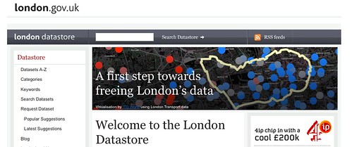
Yesterday, I was invited along to the launch of London's Datastore, the first step of freeing up London's datasets. Despite technical failures, Mayor Boris gave a masterful display of public speaking and quippery, telling us how excited he was by the prospect of increased transparency and citizen involvement in service delivery that is enabled by open data.
It has become clear that open data is now entering the political main stream, with data.gov.uk and now the London Datastore leading the way with UK goverment datasets. We were particularly thrilled that Transport for London has committed to releasing transport data through the Datastore. Among the transport data released are:
Abandoned vehicles Accessibility indicators from TFL British Transport Police: recorded crimes Bus Driver Incident Reports Number of licenced vehicles Parking penalties Road Accident Data Road injuries and deaths TFL data on transport use Traffic flows Train Overcrowding